Don't Let a Title's Detail Page Be a Dead End — Sending Viewers to the Next Title with "For Fans of This Title"
Introduction
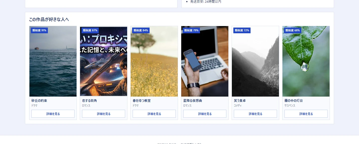
On my self-built video and music platform, I added a “for fans of this title” list of similar titles to the detail page. It’s a feature that lines up titles close to the one you’re currently viewing, below the detail content.
The technical core is nothing more than reusing the index built for semantic search. The story of implementing semantic search without adding a dedicated vector DB is in Searching by “meaning,” not “surface text”. This article isn’t about that — it’s about the design question of how I made that index work for “browsing from the detail page,” while adding it without breaking the main content.
Title detail pages easily become dead ends
In the experience of browsing a catalog, users move from a list into a detail page, and there they decide “rent it, or not.” The problem is the moment they think “not quite what I’m after.” If the detail page offers no next lead, the user either goes back to the list or leaves outright.
Left alone, a detail page becomes a dead end. Someone who got interested enough in one title to click through gets sent home without ever meeting the next candidate.
[Dead end] List ─▶ Detail ─(doesn't land)─▶ back / leave   … never meets the next thing

[Browsing] List ─▶ Detail ─(doesn't land)─▶ similar title ─▶ next detail ─▶ …
                                              └───────── browsing continues
What I wanted was to always place a “how about this instead?” at the very bottom of the detail page. To put the next title right in front of them.
Draw on the same index, wearing the face of “titles similar to this one”
This is where the index built for semantic search works as-is. Every title is already a semantic vector (the title’s content converted into a sequence of numbers; similar content lands close together as vectors, too). Semantic search returned titles close to “the vector of a query sentence.” For similar titles, the only difference is that the query isn’t a sentence — it’s “the title you’re currently viewing” itself. Query the index with the vector of the current title and return results ordered by closeness. Only the entry point differs; the machinery running underneath is the same single function as semantic search.
And rather than just listing them, I attached a similarity score (%) to each title. It shows, in a number, “why this is being recommended.” A black-box recommendation invites distrust (“why this one?”), but showing the closeness lets people accept it and move on.
// Return titles close to the base title's vector, ordered by closeness (for fans of this title)
List<Map.Entry<Integer, Double>> ranked = index.topSimilar(baseVector, limit * 4 + 1);
for (var entry : ranked) {
    if (entry.getKey() == filmId) continue;          // exclude the title itself
    var film = filmMapper.selectById(entry.getKey());
    if (film == null) continue;
    if (baseIsCd != (film.artist() != null)) continue; // same media type only (more on this below)
    items.add(Map.of("film", film, "score", round(entry.getValue()))); // with similarity score
}
Semantic search, recommendations, and this feature are three faces of the same index. The story of drawing on the same index with “the centroid of history” to produce “recommended for you” is in Building Recommendations from the “Centroid Vector” of Watch History.
A recommendation must not break the main content
This is the point I was most careful about with this feature. A recommendation is only supplementary information — it is never the star of the detail page.
Computing similar titles can fail. If a title’s vector hasn’t been generated yet, the result comes back empty; an internal call can also return an error. When that happens, letting the recommendation’s failure drag down the detail page itself would be the worst outcome. The user came to look at a title, not to look at a recommendation.
So I made the recommendation section strictly “nice to have, no harm if it’s not there.” On zero results or an error, the whole section silently disappears. The detail page’s main body (synopsis, rental info, the reserve button) stays intact regardless of whether the recommendation shows or not.
Detail page main body (synopsis, rental info, reserve)  ← always shown, doesn't depend on the recommendation's success
        └─ For fans of this title (supplementary)
              ├─ has results ─▶ show it
              ├─ zero results (vector not generated) ─▶ section is hidden entirely
              └─ API failure ─▶ section is hidden entirely (main body stays intact)
One more thing: I made it show only titles of the same media type (video for a video’s detail, CD for a CD’s detail). Draw purely on closeness in meaning, and while looking at a video, a music CD sneaks in as “similar.” This trap of embeddings’ naivety — “close in meaning” doesn’t mean “okay to show” — is covered in Vector search freely mixes in things that are just “close in meaning”. Precisely because it’s supplementary information, it must not muddy the detail page’s focus by showing something extraneous.
A recommendation isn’t the star — it’s a bridge to what’s next
Building this made it click for me that the value of this feature isn’t “a smart recommendation” in itself. The value is that it built a single bridge to the next step, on a detail page that used to be a dead end.
- Browsing is born not from a clever algorithm first, but from the single move of “placing a next step.” Whether a candidate is right there in front of the person is what decides whether they go back or move forward.
- And the bridge doesn’t break the main content even when it can’t be crossed. Whether the recommendation comes back empty or fails, the detail page stands there just the same. Supplementary information gets added only within the range that doesn’t get in the star’s way.
The same index got reused for search, for recommendations, and for this browsing feature. But what differed feature to feature wasn’t the algorithm — it was the manner of placement. Search gets pushed to the front as the star; this recommendation stays a supporting role that doesn’t get in the detail page’s way. Same tool, but the design changes depending on whether it’s the star or a supporting role — that’s what I learned from this feature.
Related articles
- The semantic vector index this recommendation reuses is covered in Searching by “meaning,” not “surface text” — implementing semantic search without adding a dedicated vector DB.
- The third face of the same index, drawn on with “the centroid of history” (recommended for you), is covered in Building Recommendations from the “Centroid Vector” of Watch History.
- The trap of a different media type that’s merely close in meaning sneaking in, and how it’s blocked at the exit, is covered in Vector search freely mixes in things that are just “close in meaning” — the trap of different-kind catalogs sneaking into recommendations.