Why Is Don Quijote So Good at Getting You to Pick Things Up? — Bringing "Compressed Display" to an All-in-One Top Screen
Introduction
I’m building an all-in-one platform that bundles multiple services into one. The vision behind it is written up in From DVD Rental to a DMM-Style Platform.
How should I build its top screen? The hint came from an unexpected place — Don Quijote, the Japanese discount store chain.
Don Quijote’s “compressed display”
Picture the inside of a Don Quijote store. All kinds of merchandise are piled up like mountains on both sides of the aisles, with no apparent logic. That’s not clutter — it’s deliberate. It’s a well-honed strategy called “compressed display” (asshuku chinretsu).
The aim is singular: put everything within eyeshot, so people “just pick it up for now.” Even if what you came looking for isn’t there, something in the pile catches your eye, and your hand reaches out. That first move — catching the eye, reaching out — becomes the starting point of a flow: browsing the store, staying longer, buying on impulse.
Here’s the crucial part. Being visible is itself the value, and the cluttered density, the information overload — that’s not a bug, it’s the strategy. People reach out more at a pile-it-high storefront than at a neatly tidied shelf.
Bringing this to the all-in-one top screen
The same thing applies to the top screen of an all-in-one platform bundling multiple services. The top screen’s job isn’t to show a polished, single, clean image. It’s to let people see “what’s here” at a glance, and just get them to touch something.
So I made the top screen compressed-display style. Tiles of titles from each service are stacked several rows deep, services still in preparation are shown labeled “coming soon,” and a permanent service list sits on the left edge.
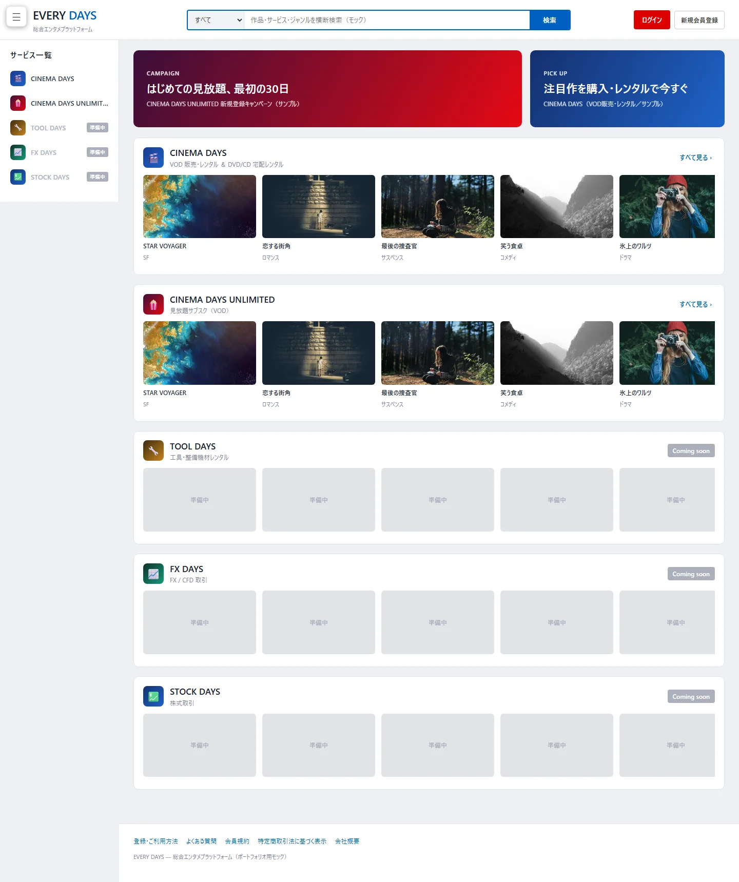
A permanent service list on the left, rows of titles stacked across multiple services, and even services yet to launch, all lined up. At a glance, it communicates “there’s a lot going on here.” This is the density meant to get people to just pick something up.
The minimalism trap
Actually, I went the opposite way once. Following UI orthodoxy — “tidy it up, keep it clean,” “tuck navigation behind a menu” — I folded the top screen’s service selector behind a hamburger menu (☰) in the top left. The screen got cleaner. But it was a change that cut value.
Folding services behind a menu is the same as taking merchandise that was piled up at the storefront and stashing it in the back of the shelf. What’s out of sight doesn’t get picked up. On an all-in-one top screen, tidying itself can backfire.
[Tidy / minimal style]              [Compressed-display style (adopted)]
 Fold services behind ☰              Services permanent + titles piled high
   ↓                                  ↓
 Clean / but "what's here"           Visible at a glance / people just pick it up
 isn't visible = not picked up        = browsing and dwell time emerge
But density isn’t “chaos”
That said, just piling things up isn’t good enough on its own. Density comes with a risk right next to it: getting visitors lost. So I prepared a skeleton that supports the density.
For reference, I looked at a major portal bundling multiple services (built like DMM). There, no matter which screen you’re on, you can always open the service list from the edge of the screen and jump to another service anytime. The service-switching pathway alone is kept permanent, never buried in the density.
That way, the top screen “gets people to just pick things up” via compressed display, while the switching skeleton is always at hand, so no one gets lost. Density to draw people in, a skeleton to support them. This became the core of the all-in-one top screen’s design.
Question before you tidy
Question the assumption that “tidy = good.” Clean and minimal is the right answer on many screens. But the right answer changes with context. On a screen whose job is “show what’s here first,” tidying can cut value. Before applying the standard playbook, ask what this screen’s job actually is.
Whether you show or hide decides whether it gets picked up. Something hidden is as good as nonexistent. On an all-in-one top screen, being visible is itself the value. Don’t be afraid of density.
Support density with a skeleton. Don’t just pile things on — run one permanent pathway outside the density that keeps people from getting lost. Make the pull-in power and the no-getting-lost power coexist.
Wisdom that’s taken for granted at a retail storefront applies directly to screen design. A UI’s “cleanliness” can be copied, but the judgment that “this screen’s job is to get people to pick things up, so we keep the density” — including the choice to go against the standard playbook — is something you have to think through each time.
Related articles
- The vision for the all-in-one platform this top screen belongs to is in From DVD Rental to a DMM-Style Platform.
- The overall picture of the customer app and its article map is in Building a Rental App for End Users.