Building a Port-Scoped Scooter Selection UI With a BottomSheet — Flutter's DraggableScrollableSheet + FutureBuilder Combo
What You’ll Learn
- A Flutter implementation pattern for showing a “scooter list” child surface after a port tap
- How to pick
initialChildSizewhen combiningDraggableScrollableSheetwithshowModalBottomSheet - A minimal way to handle “loading / error / empty / result” — four states — with
FutureBuilderfor an API-backed list - How to extract a shared widget so the home screen and destination screen share the same look
Target Audience
- Flutter developers implementing post-tap child surfaces for POIs on a map
- People who want to grow BottomSheet from “a quick modal” into “a business-grade selection UI”
- Developers who use Riverpod globally but want to write local async fetches with plain
FutureBuilder
Environment
| Item | Version |
|---|---|
| Flutter | 3.x (Material 3) |
| flutter_map | 7.x |
| flutter_riverpod | 2.x |
| dio | 5.x |
Series article (in active development) — This article is part of Building Street-Level E-Scooter Sharing From Scratch to Understand It — Design, Implementation, and Operations Series. The project is ongoing; new articles and design notes are added continuously. The series motivation, technology stack, screen-ID glossary, and the full article index are collected at the link above.
Introduction
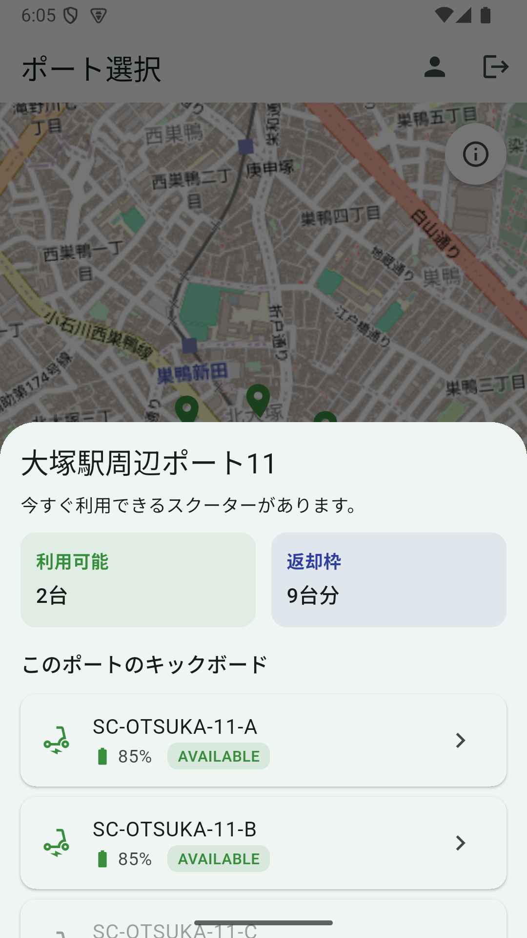
On the S02 home screen of the e-scooter sharing app, tapping a port pin used to show this sheet:
- Port name
- One line: “Scooters are available now” or “No scooters available now”
- Two cards: “Available N” and “Empty slots M”
You could see how many were available, but you couldn’t pick which scooter. The child surface needed to handle “tap pin → see scooter list → tap scooter to navigate” all in one place.
Why DraggableScrollableSheet
Three options:
showDialogfull-screen dialogpushto a new screenshowModalBottomSheet+DraggableScrollableSheet
(1) loses the map context. The feeling of “near this port” disappears.
(2) is a heavy transition. Adds a back-button trip.
(3) keeps the map in view while letting the user scroll through the scooter list. UX-wise the most natural.
The reason we chose DraggableScrollableSheet: the user can drag up to expand the sheet. On ports with many scooters, the user can pull the sheet up to see all of them.
Calling showModalBottomSheet
void _showPortSheet(PortSummary port) {
  final api = DiscoveryApi(ref.read(apiClientProvider));
  showModalBottomSheet<void>(
    context: context,
    isScrollControlled: true, // ← without this, the sheet stops at half-height
    builder: (sheetContext) {
      return _PortDetailSheet(
        port: port,
        api: api,
        onScooterSelected: (scooter) {
          Navigator.of(sheetContext).pop();
          final scooterId = Uri.encodeComponent(scooter.scooterId);
          context.push('/destination?scooterId=$scooterId');
        },
      );
    },
  );
}
Notes:
- Forgetting
isScrollControlled: truebreaksDraggableScrollableSheet’s height control - Distinguish
sheetContextfrom the outercontext. UseNavigator.of(sheetContext).pop()to close the sheet, thencontext.push(...)to navigate
DraggableScrollableSheet’s initialChildSize
class _PortDetailSheet extends StatefulWidget {
  // ...
  @override
  Widget build(BuildContext context) {
    return DraggableScrollableSheet(
      expand: false,
      initialChildSize: 0.55,
      minChildSize: 0.3,
      maxChildSize: 0.9,
      builder: (context, scrollController) {
        return SingleChildScrollView(
          controller: scrollController,
          child: Padding(
            padding: const EdgeInsets.all(16),
            child: Column(
              mainAxisSize: MainAxisSize.min,
              crossAxisAlignment: CrossAxisAlignment.start,
              children: [
                Text(port.name, style: Theme.of(context).textTheme.titleLarge),
                // summary cards + scooter list + footer
              ],
            ),
          ),
        );
      },
    );
  }
}
initialChildSize: 0.55 means “initial height is 55% of the screen.” We landed on this value because:
- 0.4 shows only 1〜2 scooters and forces scrolling
- 0.7 leaves the map too small, weakening the “this port right here” feeling
- 0.55 shows the summary cards + ~3 scooters and keeps the map half-visible — the right balance
minChildSize: 0.3 keeps at least the minimum info when the user drags down to shrink. maxChildSize: 0.9 lets the user drag up to nearly hide the map and see the full scooter list.
The destination screen (return-port selection) shares the same initialChildSize: 0.55, so both enabled and disabled cases appear at the same size.
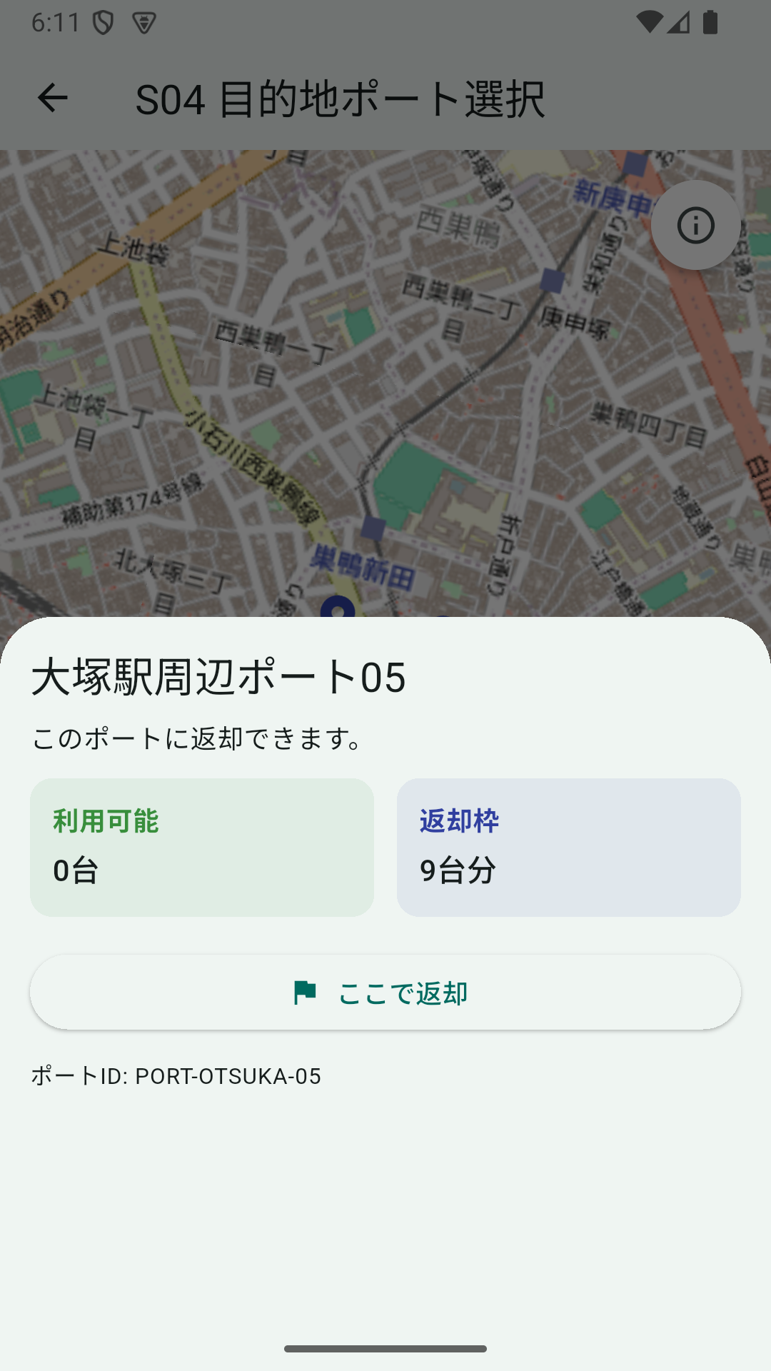
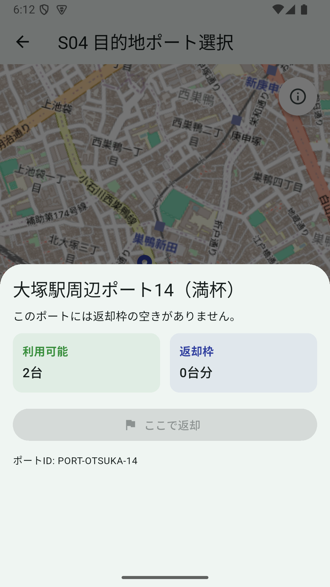
The disabled branch is port.availableEmptySlots == 0 → ElevatedButton.onPressed: null. “Can’t ride / can’t return” is consistently expressed as “tap-or-not” across screens, which becomes a rule that holds horizontally.
FutureBuilder for the Scooter List
The scooter list needs an API call, so we handle four states: loading / error / empty / result.
class _PortDetailSheetState extends State<_PortDetailSheet> {
  late Future<List<ScooterSummary>> _scootersFuture;

  @override
  void initState() {
    super.initState();
    _scootersFuture = widget.api.getScootersInPort(widget.port.portId);
  }

  void _retry() {
    setState(() {
      _scootersFuture = widget.api.getScootersInPort(widget.port.portId);
    });
  }

  // inside build
  FutureBuilder<List<ScooterSummary>>(
    future: _scootersFuture,
    builder: (context, snapshot) {
      if (snapshot.connectionState == ConnectionState.waiting) {
        return const Padding(
          padding: EdgeInsets.symmetric(vertical: 16),
          child: Center(child: CircularProgressIndicator()),
        );
      }
      if (snapshot.hasError) {
        return Column(
          crossAxisAlignment: CrossAxisAlignment.start,
          children: [
            Text('Failed to load scooters.',
                style: TextStyle(color: Colors.red.shade700)),
            const SizedBox(height: 8),
            OutlinedButton(onPressed: _retry, child: const Text('Retry')),
          ],
        );
      }
      final scooters = snapshot.data ?? const <ScooterSummary>[];
      if (scooters.isEmpty) {
        return const Text('No scooters registered at this port.');
      }
      return Column(
        children: scooters.map((s) => _ScooterListTile(
          scooter: s,
          onTap: s.isAvailable ? () => widget.onScooterSelected(s) : null,
        )).toList(),
      );
    },
  )
Points:
- Build
_scootersFutureonce ininitState. Callingwidget.api.getScootersInPort(...)directly inbuildwould refetch on everysetState - “Retry on error” simply rebuilds
_scootersFutureviasetState - Branch separately for empty arrays. Use
snapshot.data ?? const <ScooterSummary>[]for null safety
Riverpod’s FutureProvider is an option, but for “a Future that lives only while this sheet is open,” a local FutureBuilder is simpler.
Scooter Tile (Only AVAILABLE Is Tappable)
class _ScooterListTile extends StatelessWidget {
  const _ScooterListTile({required this.scooter, required this.onTap});

  final ScooterSummary scooter;
  final VoidCallback? onTap;

  @override
  Widget build(BuildContext context) {
    final disabled = onTap == null;
    final statusColor = switch (scooter.status.toUpperCase()) {
      'AVAILABLE' => Colors.green.shade700,
      'IN_USE' => Colors.orange.shade700,
      'MAINTENANCE' => Colors.grey.shade600,
      _ => Colors.grey.shade600,
    };
    return Card(
      margin: const EdgeInsets.symmetric(vertical: 4),
      child: ListTile(
        onTap: onTap,
        leading: Icon(Icons.electric_scooter,
            color: disabled ? Colors.grey : statusColor),
        title: Text(scooter.scooterId,
            style: TextStyle(color: disabled ? Colors.grey : null)),
        subtitle: Row(/* battery level + status badge */),
        trailing: disabled ? null : const Icon(Icons.chevron_right),
      ),
    );
  }
}
Setting onTap to null makes the entire ListTile inactive. This is Material standard behavior, no need to implement a disabled prop.
Dart 3’s switch expression lets you map state → color declaratively, which feels clean.
Extracting the Shared Widget
We ended up wanting the same “available / empty slots” cards on both the home and destination screens. Initially each screen held a private _PortStatCard. We extracted it into widgets/port_stat_card.dart as a shared widget.
class PortStatCard extends StatelessWidget {
  const PortStatCard({
    super.key,
    required this.label,
    required this.value,
    required this.accent,
  });

  final String label;
  final String value;
  final Color accent;

  @override
  Widget build(BuildContext context) {
    return Container(
      padding: const EdgeInsets.all(12),
      decoration: BoxDecoration(
        color: accent.withValues(alpha: 0.08),
        borderRadius: BorderRadius.circular(12),
      ),
      child: Column(
        crossAxisAlignment: CrossAxisAlignment.start,
        children: [
          Text(label, style: TextStyle(color: accent, fontWeight: FontWeight.w700)),
          const SizedBox(height: 4),
          Text(value, style: Theme.of(context).textTheme.titleMedium),
        ],
      ),
    );
  }
}
Only accent color is passed in, with background and text colors derived from it. Pass Colors.green.shade700 for the available card, Colors.indigo.shade700 for the empty-slot card, and one widget covers both looks.
Pitfall: The replace_all Refactor Trap
When renaming _PortStatCard to PortStatCard, an IDE “replace all” only replaced the constructor calls and left the class definition (class _PortStatCard) intact — Dart syntax error.
class _PortStatCard extends StatelessWidget {  // ← still underscore-prefixed
  const PortStatCard({                          // ← but constructor is unprefixed
    // ...
  });
}
This happened because “the string _PortStatCard(” was the replace target (the class declaration class _PortStatCard isn’t followed by a ().
Fix: create the shared widget in a new file, then delete the old class entirely. Don’t trust replace_all too much.
Lessons
- Post-tap child surfaces over a map are most natural as
showModalBottomSheet+DraggableScrollableSheet initialChildSize: 0.55is the heuristic balance for summary + several list items + map still half visible- Local async fetches are fine with
FutureBuilder. No need to reach for Riverpod’sFutureProvider - Shared cards that only receive
accentand derive other colors reuse easily across screens
Even a simple child surface has plenty of room for craft when you want to finish business actions without breaking the map UX flow.