The Choice Not to Unify Desktop and Mobile with Responsive CSS, and How to Verify
Introduction
When building UIs, the idea of “write @media in CSS and handle both desktop and mobile in one place” is common.
However, this app takes the approach of not using @media-based responsive CSS, but instead designing desktop and mobile screens as completely separate files.
This records why we made that choice, and how we verify each.
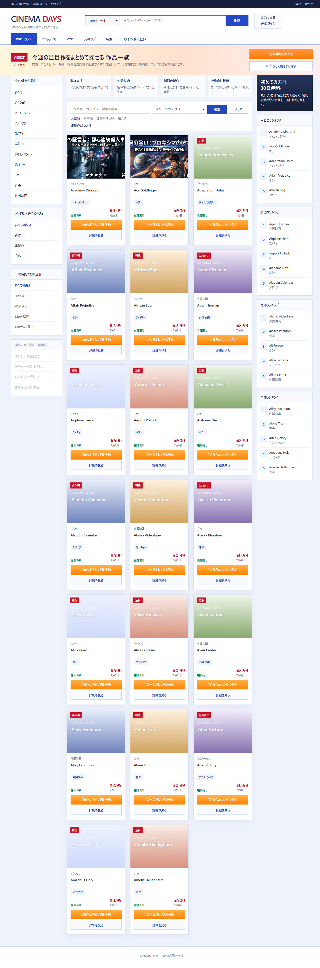
Why We Don’t “Unify with @media”
① Desktop and Mobile Have Different “Things to Show and Interact With”
Desktop can increase information density with a fixed-width layout.
Mobile prioritizes tap operations, flowing content in a single column.
This difference can’t be solved just by “changing the width with CSS.” Component structure, element order, and button sizes — everything changes.
Trying to change only the appearance of the same HTML with @media tends to produce screens that are optimized for neither desktop nor mobile.
② Adding “Mobile Support” Afterward Makes CSS Fragile
The approach of adding @media later to components built for desktop leads to complex CSS overrides, increasing the risk of breaking the desktop layout.
③ Testing and Reviews Tend to “Verify Only One Side”
When desktop and mobile styles are mixed in one file, fixing one side often accidentally breaks the other without noticing.
This App’s Policy
| Target | Policy |
|---|---|
| Desktop screens | Currently active. FilmsView.vue, FilmDetailView.vue, etc. — desktop-only design |
| Mobile screens | Will be implemented as separate components and separate files in the future |
Prohibited:
- Adding
@mediato existing desktop components after the fact - Using Bootstrap or Tailwind’s “two birds with one stone responsive support”
- Verifying desktop and mobile in the same file
Desktop Screen Verification Procedure
1. Open Chrome DevTools in Desktop Mode
1. F12 (open DevTools)
2. Confirm the device toolbar (phone icon) is OFF
3. Keep window width at 1200px or more
Do not switch to Responsive mode (DevTools’ mobile simulator).
Desktop components should be verified at desktop width.
2. Operate and Verify Each Main Screen in Order
- Film list (both sidebar expanded and collapsed)
- Film detail (image fallback, video playback)
- Login and member registration flow
- My Page, rental history, payment history
- Payment flow (normal header switches to Isolated Checkout header)
3. Verify by Changing Authentication State
Not logged in → View film list → Detail → Login → Navigate to My Page
Logged in → My Page → History → Payment flow
Verify that the layout correctly switches before and after login.
// App.vue (implementation switching tab display based on auth state)
<a
  v-if="!isAuthenticated"
  @click="currentPage = 'auth'"
>
  Login / Register
</a>
<a
  v-else
  @click="currentPage = 'mypage'"
>
  My Page
</a>
Mobile Screen Verification Procedure (When Implemented in the Future)
Mobile screens will be created as separate components and separate files from desktop.
Verification will also be completely separated.
❌ Verified desktop components in Chrome DevTools' Responsive mode
✅ Verified mobile-specific components on actual device or Chrome DevTools mobile simulator
Screen Width Detection in Vue 3 (Reference: Intended for Future Mobile Implementation)
When creating mobile-specific components, JS-based screen width detection may sometimes be needed.
This is strictly for “mobile-specific component initialization” and not for mixing into desktop components.
// Determine initial sidebar state based on screen width (example: desktop-only component)
const isSidebarOpen = ref(window.innerWidth > 991)
// Determine screen width with matchMedia (reference for future mobile-specific components)
const isMobile = window.matchMedia('(max-width: 991px)').matches
Summary
This app’s policy:
❌ Write @media to unify desktop and mobile support in one place
❌ Use Bootstrap's responsive grid for "two birds with one stone"
❌ Add @media to existing desktop components after the fact

✅ Design desktop and mobile screens as separate files from the start
✅ Verify desktop at desktop width, verify mobile with mobile-specific means
✅ Keep the implementation timing of both independent
The decision was “design as separate screens from the start” rather than “write @media = both supported.”
This App’s Design Policy: Create Separate Mobile-Specific Screens Rather Than Responsive
This DVD rental app does not adopt responsive design.
Adopted Policy
| Item | Content |
|---|---|
| PC screen | Fixed width 1240px (min-width: 1240px), horizontal scroll operation |
| Mobile screen | To be created separately as a mobile-specific component within the same app |
| Features | Both PC and mobile screens provide equivalent features |
@media queries | Basically not included in PC components |
/* App.vue: PC screen with fixed width and horizontal scroll support */
.page-shell {
  min-width: 1240px;  /* Even when width shrinks, can reach right edge with horizontal scroll */
}
Rather than hiding the right edge with overflow-x: hidden, the design maintains the ability to reach the right column via horizontal scroll.
Why Not Responsive?
The responsive approach introduced in this article is about “handling all devices with one component.”
On the other hand, since the information density, operation style, and layout policy differ significantly between PC and mobile in this project,
rather than adding @media to the same component later, we chose to design mobile-specific components separately.
This decision follows the same thinking as how e-commerce services like Amazon, Rakuten, and DMM
design PC and mobile as completely separate UIs.
Summary
The checklist introduced in this article covers “verification items when making one code responsive.”
When taking the design policy of “creating a separate dedicated screen for mobile,” the scope of this checklist applies to mobile-specific component development.